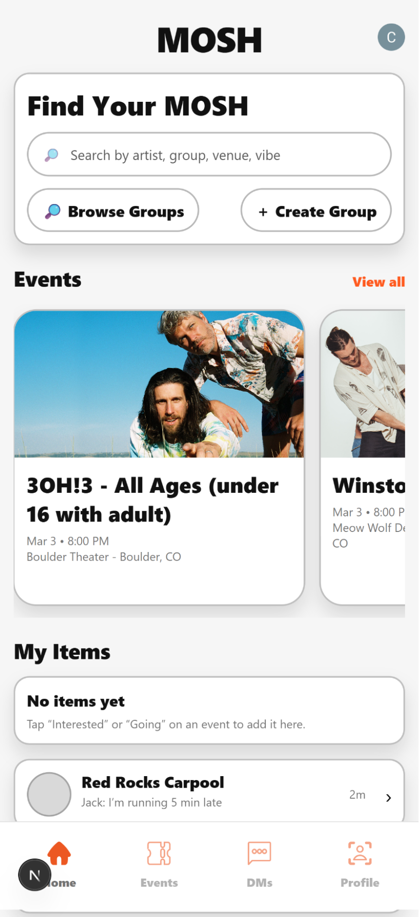
Home & Events Feed
The home feed and events tab pulling live concert data from the Ticketmaster-powered backend, the first time the app showed real shows instead of placeholder content.
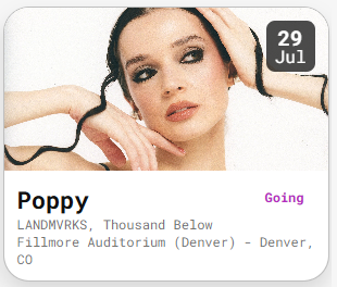
Event Card
The event card showed the key details for a show: name, date, venue, and a one-tap RSVP, designed to be readable in a feed without extra noise.
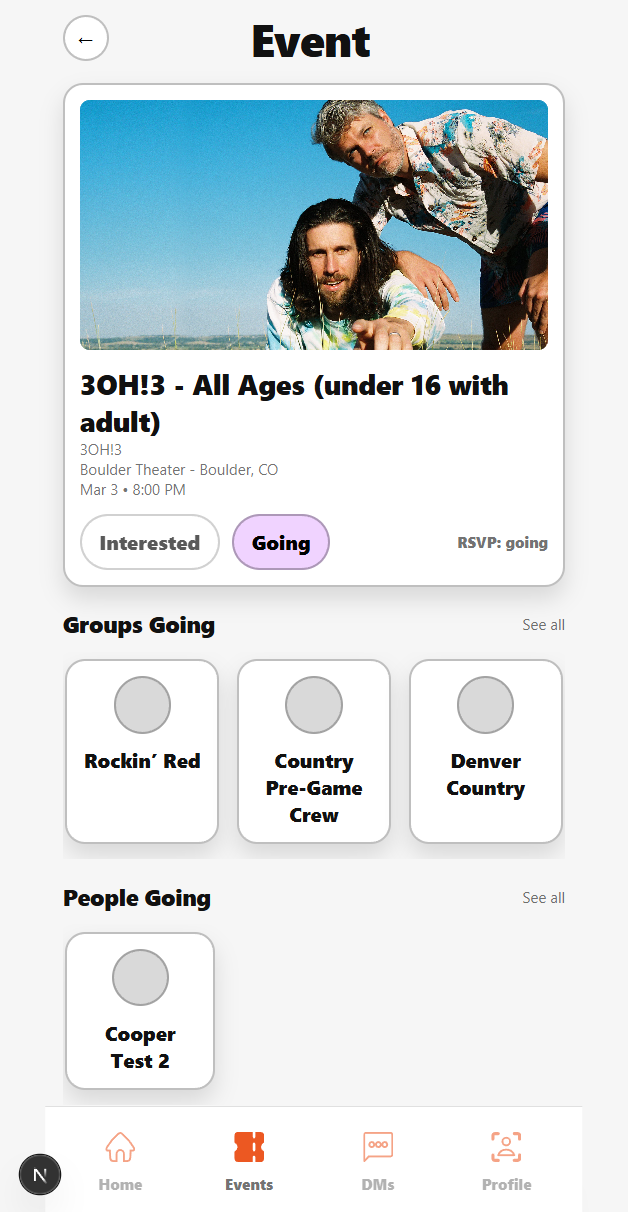
Social Activity - People Going
The "people going" section showed which friends and group members had RSVPed to the same event, making it easy to coordinate around shows.
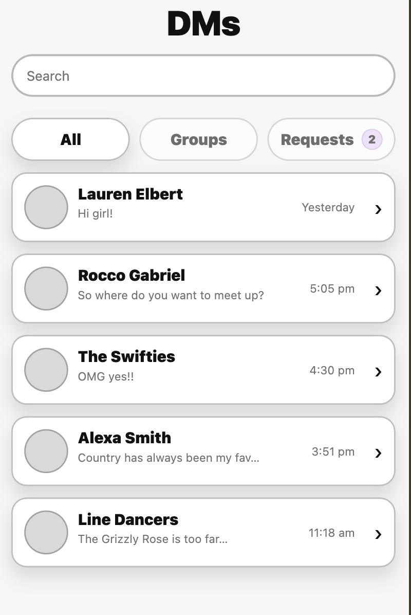
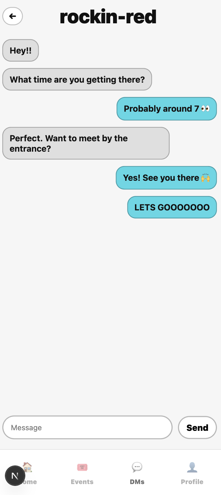
DMs - All Conversations
The DMs page listed every active conversation in one place, both direct messages and group chats, with real-time unread indicators.
Group Chat
Group chat messages delivered instantly to every member. Convex real-time subscriptions pushed new messages to all connected clients without any polling or page refresh needed.
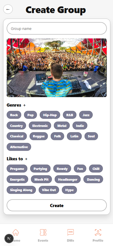
Create Group
The create group form collected name, description, genre, and tags, the same fields the search ranking system used to match users to groups, so new groups showed up in search right away.
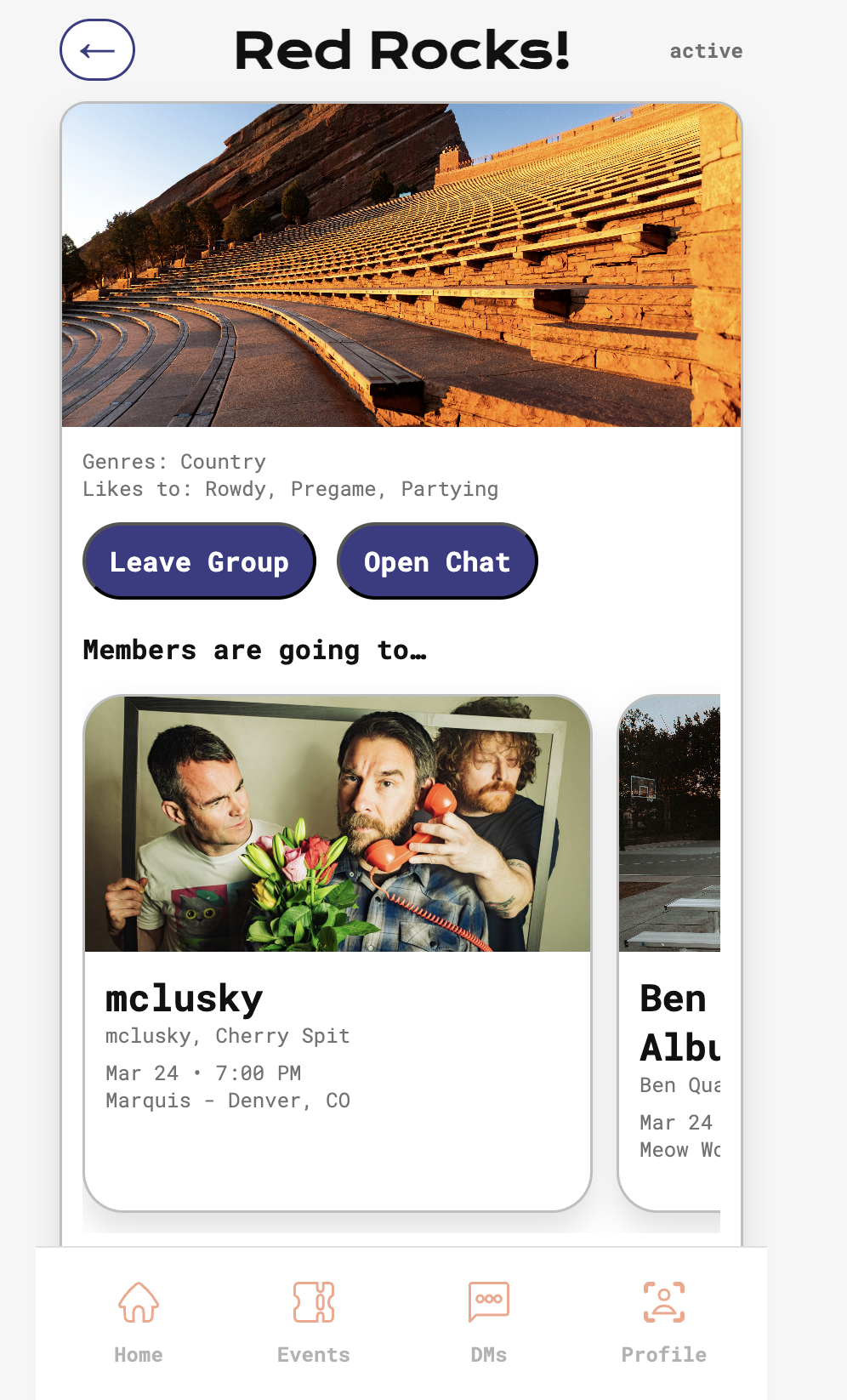
Group Page - Member View
Regular group members saw the group feed, shared events, and the member list, a simpler view than the admin version focused on what matters once you've already joined.
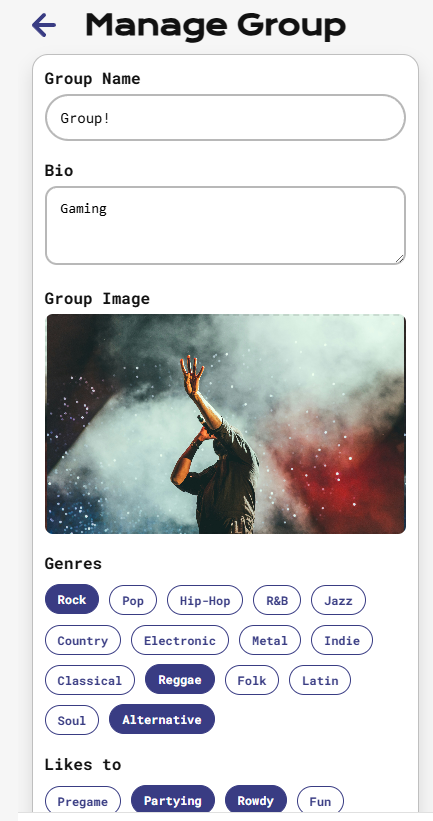
Manage Group - Admin Controls
Group admins had a management page where they could accept member requests, update group details, and control who could invite others, a role-based view that reused most of the same components as the member view.
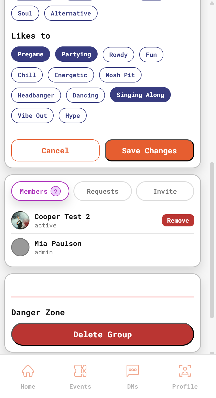
Manage Group - Member List
A second admin view showed the full member list with options to remove members and manage pending invites.
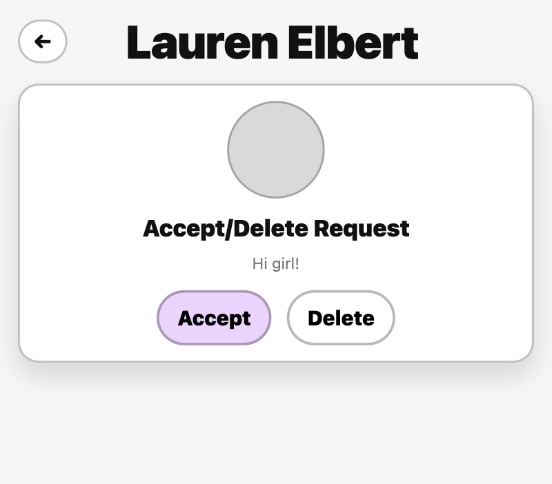
Message Request Component
Before a DM thread opened, recipients saw a message request so they could accept or decline contact from people outside their friend network.